Product Design Mobile App Health & Fit

When hardware
outgrows its software

A proposal to redesign Garmin Connect, transforming a clinical data dashboard into a contextual health intelligence layer for serious athletes.

MY ROLE Lead Product Designer
TYPE Self-initiated Proposal
SCOPE UX Research · Product Strategy · UX/UI Redesign
PLATFORM Mobile App

01: THE CHALLENGE

A hardware icon with a software crisis

Garmin makes some of the most respected fitness devices in the world, used by everyone from everyday runners to elite athletes, mountaineers, and military professionals. But its companion app, Garmin Connect, can sometimes feel harder to connect with on a human level. Users are given a huge amount of biometric data, yet often without enough context or practical guidance to help them understand what it means or how to act on it in their daily lives.

"The hardware is excellent. The software leaves a lot to be desired, and it's becoming outdated."

Vitor, Garmin Instinct user for 2.5 years

This goes beyond a minor usability issue. As competitive platforms continue to make health insights feel more intuitive and actionable, Garmin Connect can sometimes feel overly focused on data, offering plenty of information but less clarity, interpretation, and practical day to day guidance.

P.01

No morning narrative

Users see raw numbers, a Sleep Score of 72, HRV of 41, but receive no contextual interpretation. What does it mean for today's training?

P.02

Activity history has no consistent home

Activities surface in three places (Home, Profile, Activities tab) with different formats each time. Users can't form a consistent mental model of where their data lives.

P.03

Inaccessible sleep visualisation

Light sleep and wake periods share nearly identical shades of pink. Users can't distinguish stages without reading the legend on every single view.

P.04

Historical data trapped

To find a specific HRV reading from three weeks ago, you scroll backwards date by date. No filtering, no search, no range selection.

P.05

Body Battery without a story

Body Battery is a single number with no trend and no context. Users cannot tell if they are recovering well or draining faster than usual compared to recent days.

P.06

No signal for healthy consistency

Each day is logged in isolation. There is no view of whether sleep, steps and stress targets are being met consistently over time.

Original App: Identified Pain Points

Screenshots from Garmin Connect prior to redesign, captured during user observation sessions.

Garmin Connect home screen

Home: data dump

Garmin sleep score

Sleep: ambiguous colours

Garmin activities list

Activities: unintuitive path

Garmin body battery

Body Battery: buried in data

02: RESEARCH, LANDSCAPE & STRATEGY

One insight, three angles

User interviews, App Store synthesis, and a competitive audit all pointed to the same conclusion. Garmin Connect has the richest biometric data in the category. The interface just does not make it feel that way.

User Research

Users check sleep and readiness every morning but numbers without context leave them guessing. A score tells you nothing about whether to train hard today.

Competitive Landscape

Competitors make health data feel intuitive and actionable. Garmin has the hardware precision advantage but it is buried under interface complexity.

Strategic Response

Garmin does not need to copy competitors. It needs to build a UI layer that makes its unmatched biometric data legible, contextual, and motivating.

Design Priorities

Three strategic decisions that shaped every design choice.

01

Morning Context First

Replace the data dump home screen with a contextual morning summary. Instead of numbers, give users a sentence: You slept well. HRV is trending up. Your body says go hard today. Surface the watch motivational phrases in the app interface.

02

Sleep as a Story

Redesign the sleep module with accessible, distinct colours across all four stages. Add a plain language nightly summary at the top.

03

All Activities List

Introduce a unified All Activities list as a dedicated entry point, giving users a clear, chronological view of every logged workout.

03: PROCESS

How the work evolved

This project followed a Design Thinking approach from the start. Lead with empathy, understand the real problem beneath the surface complaints, then ideate and prototype before committing to a final direction.

1
EMPATHISE

Discovery & Audit

Immersed in Garmin Connect as an active user. Documented every friction point and delight. Ran a heuristic evaluation and catalogued issues.

2
EMPATHISE

User Research

Conducted 60 minute contextual interviews observing participants in the live app. Supplemented with App Store review synthesis to surface patterns at scale.

3
DEFINE

Synthesis & Framing

Built an empathy map and applied the 4U framework to every finding. Narrowed issues down to 3 clearly defined strategic opportunities.

4
IDEATE & PROTOTYPE

Design & Iteration

Started with low fidelity wireframes. Studied health apps in the market to identify the strongest solution for Garmin Connect.

5
TEST

Validation & Handoff

Shared interactive prototypes with Garmin users for informal sessions. Observations led to final adjustments and annotated documentation.

04: THE REDESIGN

From data dump to health intelligence

Five key screens redesigned with a single principle: every screen should answer a question, not just display a number.

Screen 01: Home

Your morning briefing,
not your data archive

The home screen is structured as a three-tier morning narrative: a coaching voice recommendation at the top ('You're ready to train'), a compact metric strip below, and At a Glance ring gauges for all key health pillars. Every element answers a question rather than just displaying a number.

Three-tier information hierarchy following F-pattern scanning
Coaching voice replaces raw numbers ('You slept well' before the score)
Ring gauges replace flat numbers, matching Garmin's native visual language
Garmin home redesign Garmin home scrolled
NEW

Habit Formation Feature

Consistency Bar

Inspired by Seinfeld's 'don't break the chain' method. Each health pillar (Sleep, Activity, Stress and Steps) gets its own 14-day bar chain filled in its signature colour. The hero number counts consecutive days all four pillars were on track simultaneously.

Consistency Bar component

Chain mechanic

14 day bars per pillar; height encodes quality: stub = miss, medium = partial, tall = on track.

Hero metric

Counts only days when all 4 pillars are on track simultaneously, the true consistency signal.

Per-pillar streaks

Each pillar shows its own streak badge to pinpoint the weakest link (e.g. Sleep 9d, Stress 6d).

CTA

'Don't break the chain' with today's log prompt, action oriented rather than data passive.

Screen 02: Sleep

Sleep as a story,
not a bar chart

The sleep module is redesigned around narrative first, data second. A plain-language summary leads. The stage visualisation now uses a four-colour palette that passes WCAG AA contrast requirements.

Plain-language nightly summary as the entry point
Accessible, distinct colours for all four sleep stages
HRV, respiration, and resting HR grouped as "While You Slept"
7-day comparative view as the default tab, not a secondary option
Sleep Details

Sleep Details

Sleep Details scrolled

Sleep Details scrolled

While You Slept

While You Slept

7-day comparative

7-day comparative

7-day scrolled

7-day scrolled

Sleep log & history

Sleep log & history

INTERACTION DESIGN

One colour scale, every screen

All quality ratings follow the same colour progression: yellow for Fair, lime for Good, green for Excellent. Applied consistently across the Sleep Score Scale and Training Readiness chip states so users never need to re-learn the scale when switching context.

Sleep score scale Training readiness
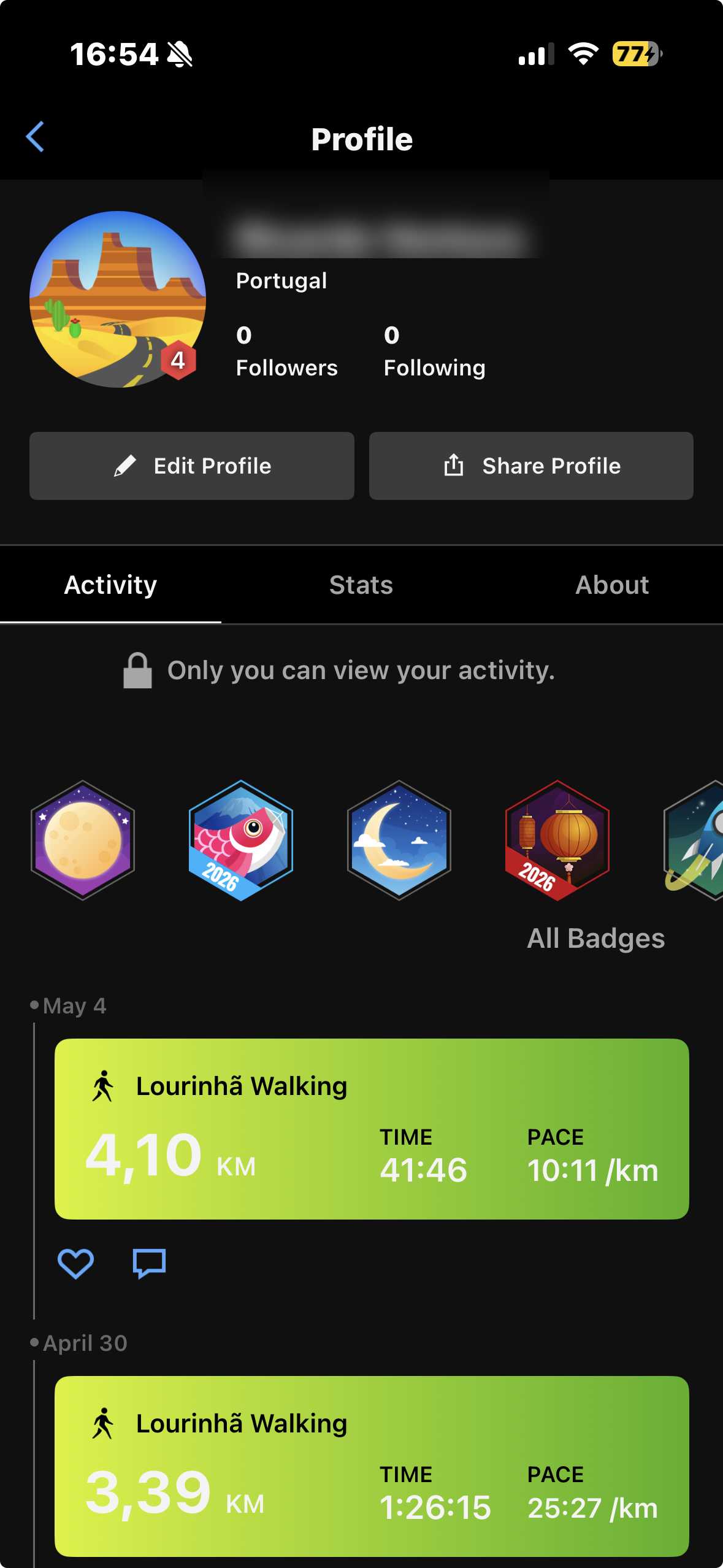
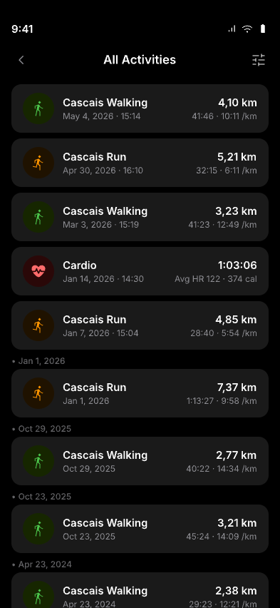
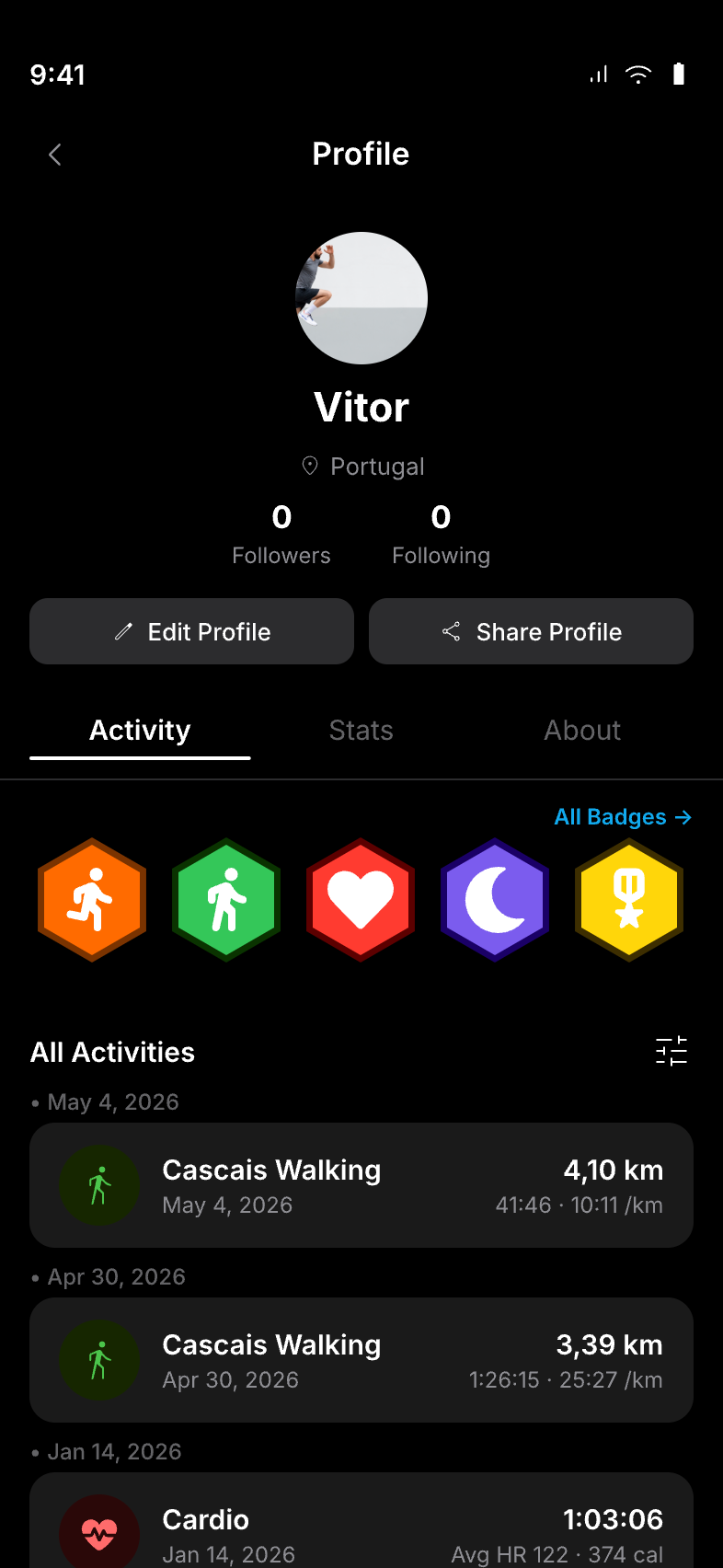
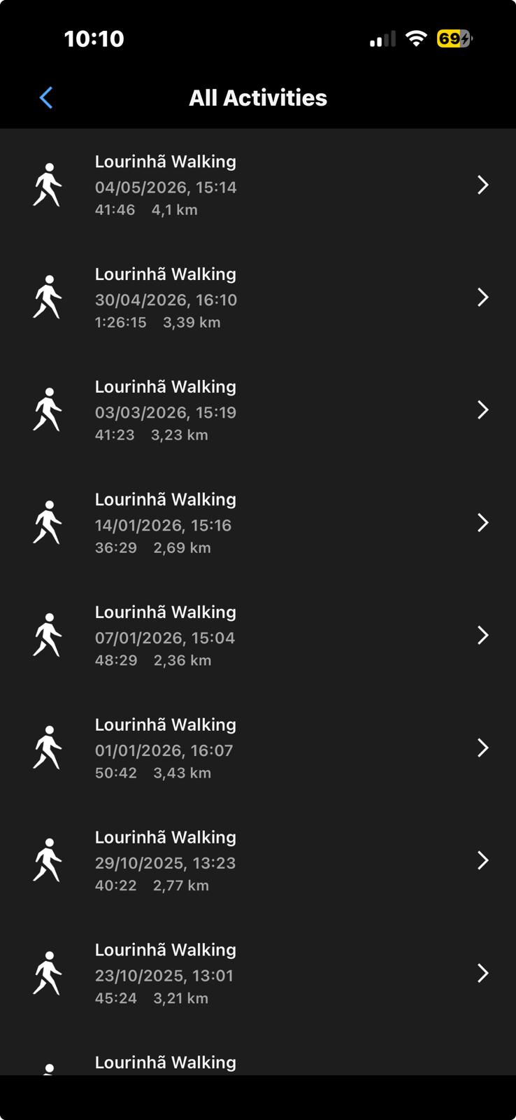
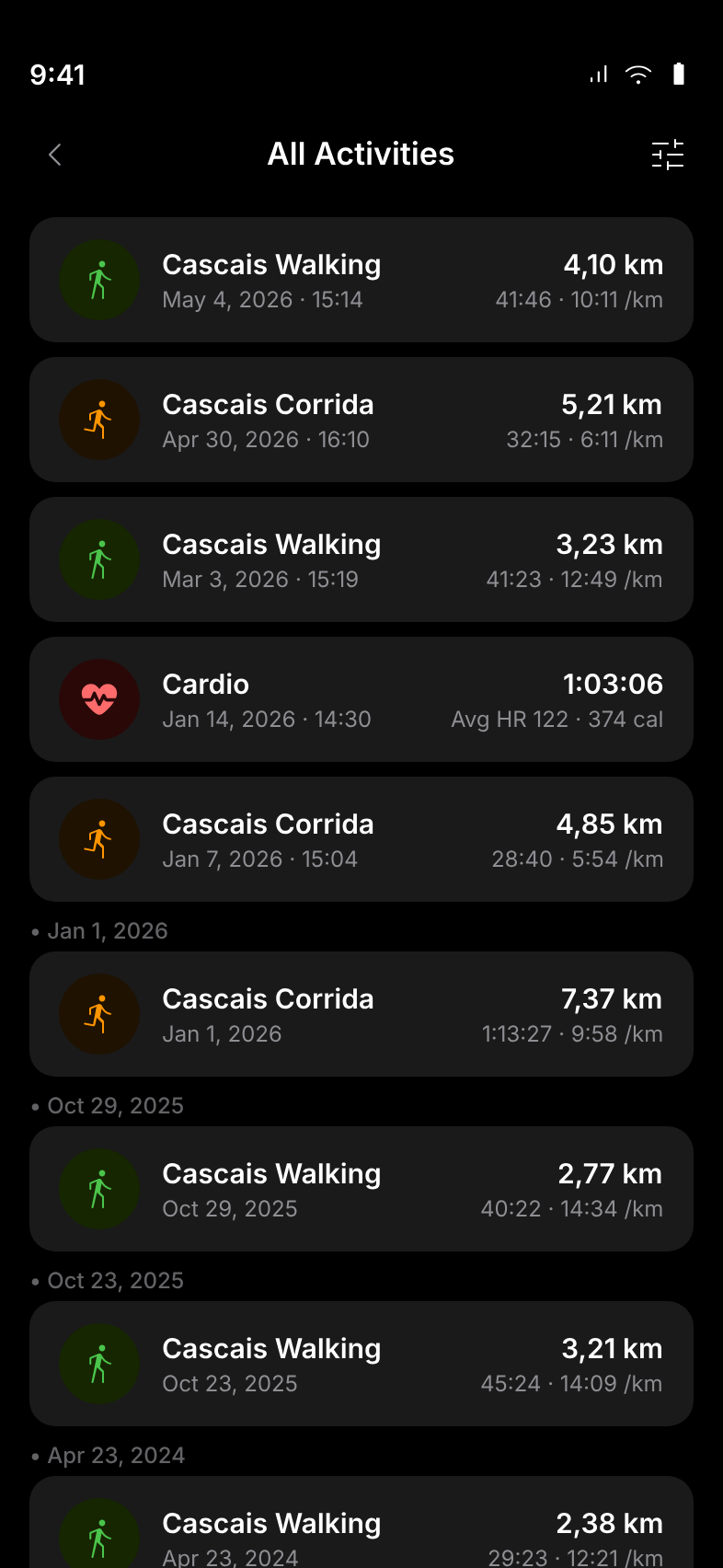
Screen 03: All Activities

Your workouts,
finally front and centre

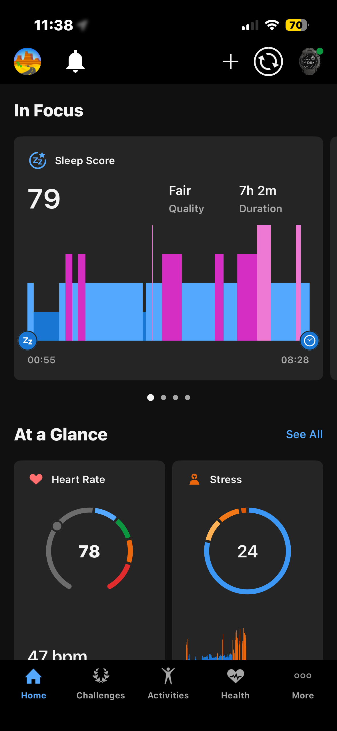
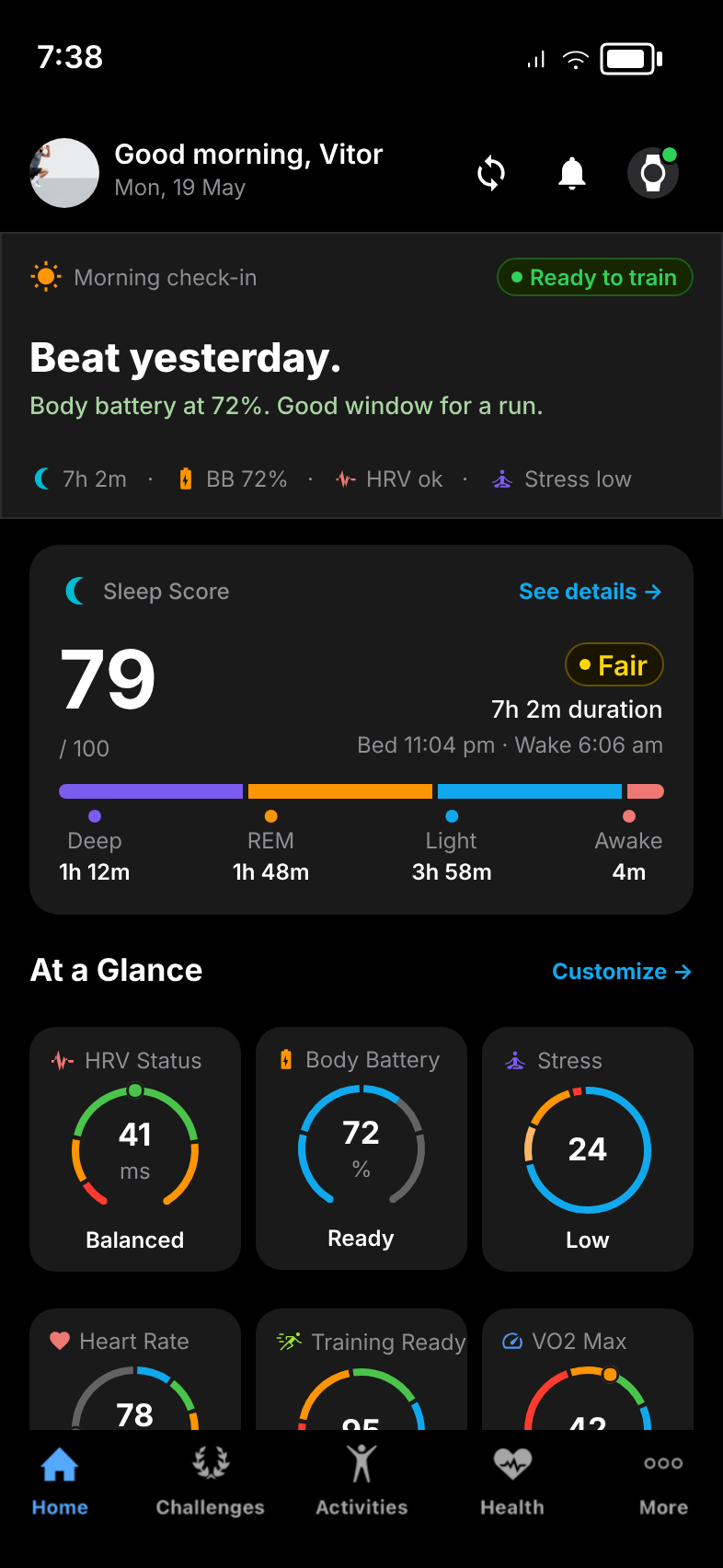
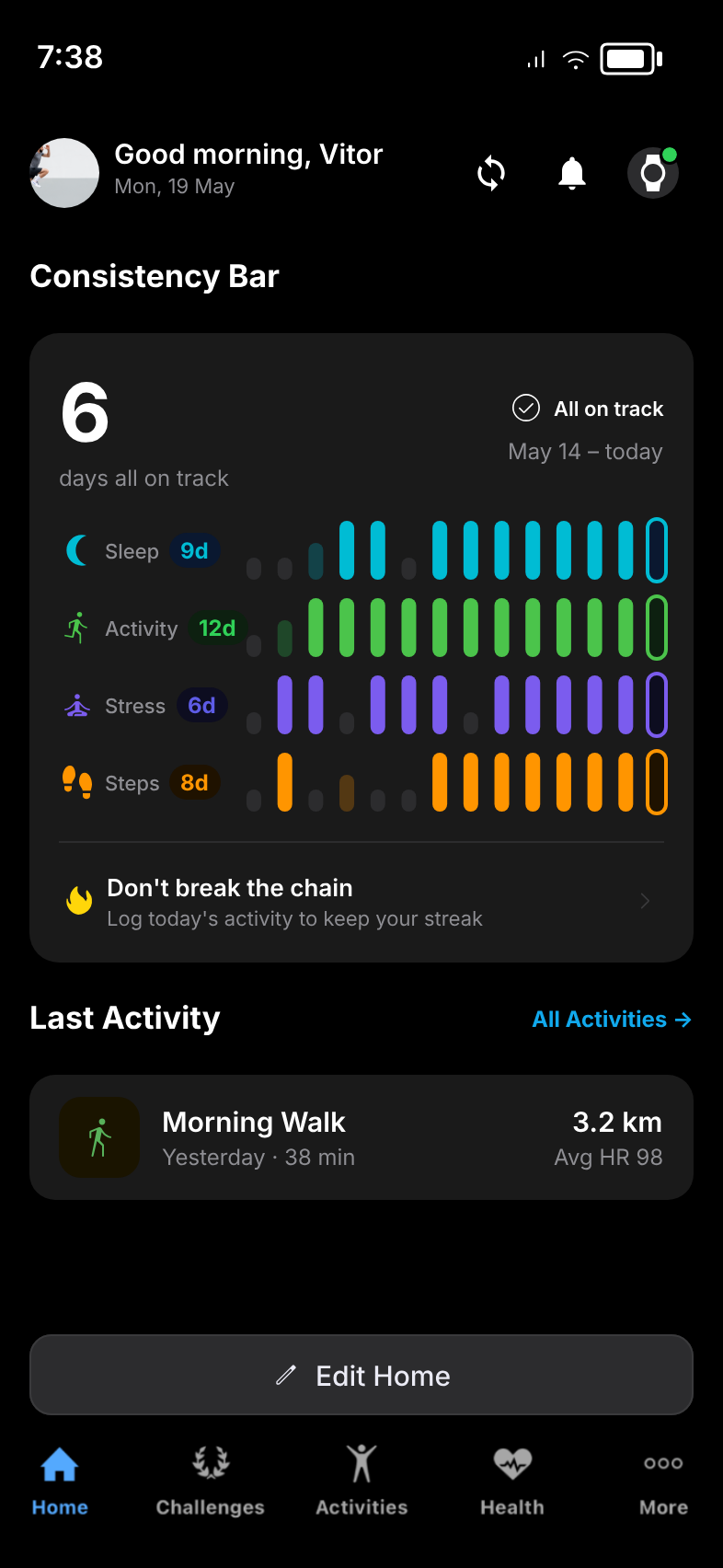
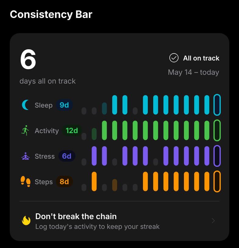
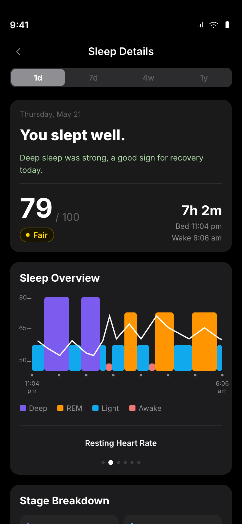
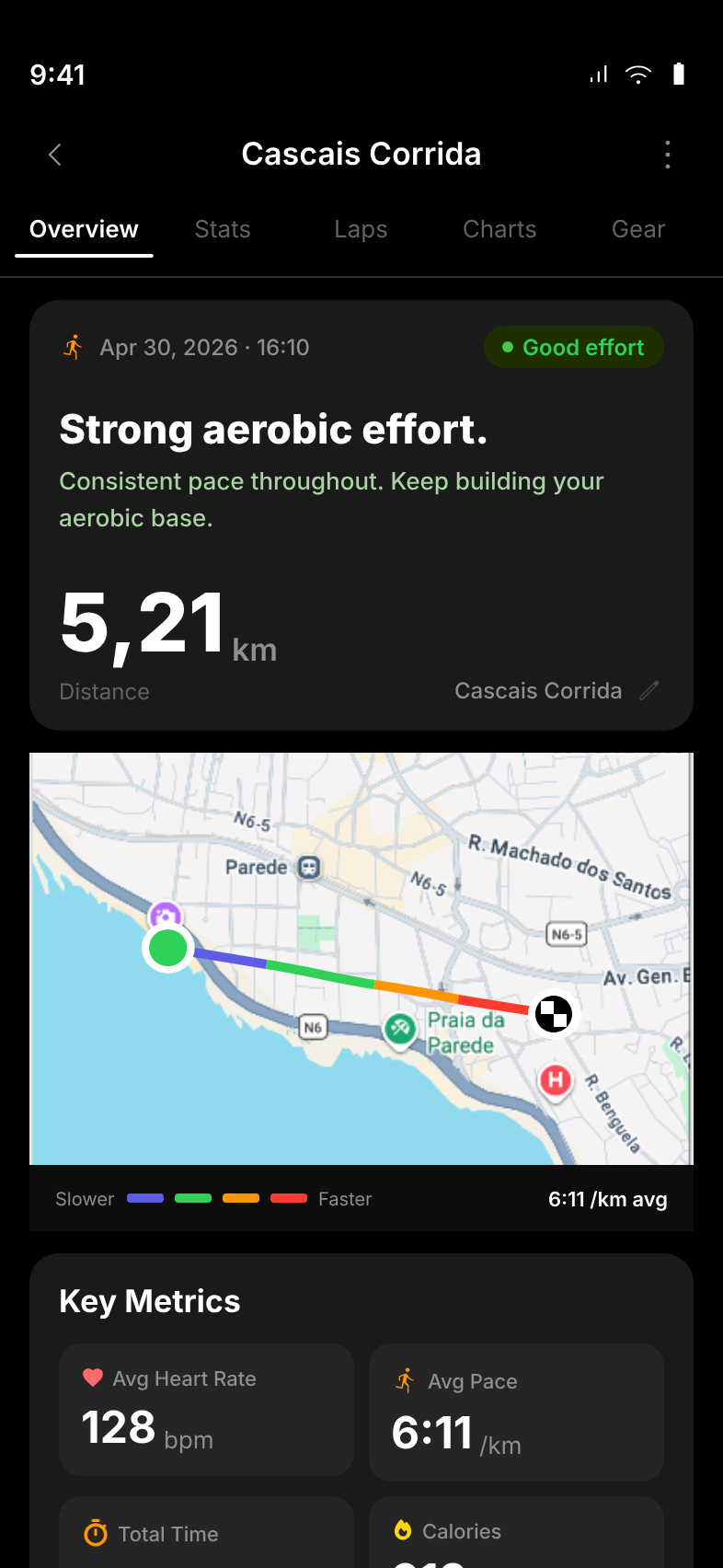
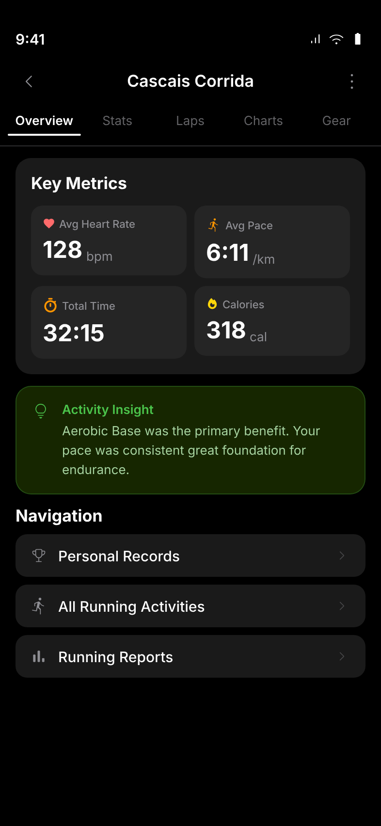
Activity history is restructured as a chronological, scannable feed, the first tab in the navigation, not buried under the profile. Each card shows the key post-workout summary: type, duration, heart rate zone, and distance at a glance. The same 'All Activities' list appears consistently on the Home screen, Profile, and Activities tab using the same card format and interaction pattern.

Activities promoted to primary bottom navigation position
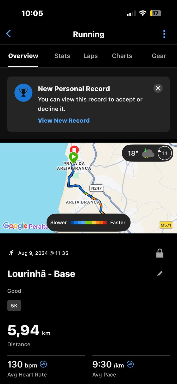
Filter by activity type, date range, or heart rate zone
Same 'All Activities' card format used across Home, Profile, and Activities tab; one pattern, no re-learning
At-a-glance card layout with consistent metric hierarchy
Removed category-type "Activities" list that confused activity history with activity types
All Activities screen Profile redesign
Screen 04: Activity Detail

The debrief your workout deserves

The activity detail screen is restructured around the post-workout ritual, first the headline metrics (time, distance, pace), then the heart rate story, then the technical breakdown. The route map is surfaced at the top for GPS activities.

Activity detail screen Activity key metrics

Activity detail (left) and key metrics breakdown (right)

Before → After

The delta

Side-by-side comparisons of the most significant UX changes.

Before After
BEFORE Original home
AFTER Redesigned home

Home Screen: Adding morning narrative context

Before After
BEFORE Original sleep
AFTER Redesigned sleep

Sleep Details: Narrative summary + accessible colour system

Before After
BEFORE Original activities
AFTER Redesigned activities

Activities: Unified history vs. type categorisation

Before After
BEFORE Original activity detail
AFTER Redesigned activity detail

Activity Detail: Structured debrief hierarchy

05: OUTCOME

Design impact: projected

As a proposal, these are projected improvements based on the problems identified. Validation with real users would be required before shipping.

4→1 Taps to find most recent activity
100% Sleep stage colours pass WCAG AA
3 Screens redesigned with contextual narrative

06: REFLECTION

Insights

Redesigning a mature product used by serious athletes surfaces a consistent tension: the richer the data, the more essential the narrative layer becomes. Without context, every metric is just a number. Working without access to Garmin's design system or analytics forced every decision to be grounded in observed behaviour rather than assumptions, which made the research stronger and the constraints more honest.

"Users don't complain about the right things, they complain about symptoms, not causes. The real problem is never what they say it is in the first answer."

Observation from the user interview process

Observed behaviour beats reported behaviour

Vitor said he checks the app "for everything." When observed live, he only checked sleep, HRV, and heart rate. The live session revealed the real mental model; the interview script alone would have missed it.

Simplification without interpretation is still a failure

Garmin's 2024 redesign removed data clutter but replaced it with nothing. It swung from data overload to data obscurity, skipping the crucial middle state: a view that interprets rather than just displays. Reducing complexity only works when something more meaningful takes its place.

Constraints are design tools

Having no access to Garmin's design system forced me to build components from first principles. Reverse-engineering the interface revealed many of the app's underlying structural problems.

Research quality over quantity

The experiences reported during user interviews closely matched patterns found across App Store reviews. This convergence between interview insights and large-scale review data strengthens the findings and informs prioritisation.

If this were real: next steps

Training goals on mobile

Weekly and monthly training targets are currently only accessible on the desktop browser. Bringing goal-setting and progress tracking to mobile is the highest-impact missing feature, identified in the task analysis as entirely unreachable for users who manage training from their phone.

Activity filtering and direct comparison

Users cannot filter their activity log by sport type, nor compare a current session directly against a previous equivalent. Both were identified as top friction points; the history tab functions as an archive today, not an analytical tool.

Inline metric explanations

Users routinely search Google to understand what HRV Status, Training Readiness, and Body Battery mean for their daily decisions. An on-demand explanation layer, shown inline and never in the way, would close the gap between data and understanding without simplifying the product.

NEXT CASE STUDY

Explore more work

View all projects →