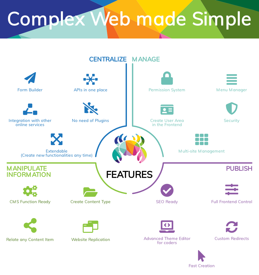
A modern brand identity and website designed for a CMS platform entering a crowded market, built on personality, colour, and a very specific crab.
01: THE CHALLENGE
Crably needed a brand identity that could stand out in a market dominated by minimalist, corporate CMS aesthetics, while communicating approachability, creativity, and the playful edge implied by its name.
Starting from zero meant every design decision had to simultaneously establish personality, build trust, and be versatile across all digital touchpoints.
WordPress, Weebly, and Wix dominate with clean but generic aesthetics. Differentiation required a deliberately creative position, risky but necessary.
Reconciling stakeholder preferences around tone, colour, and logomark while ensuring long-term brand scalability was the central design constraint.
02: CREATIVE PROCESS
A thorough competitive audit of WordPress, Weebly, and Wix revealed a consistent pattern: minimalist, professional aesthetics that prioritise function over personality. This created a clear opportunity to position Crably with creative appeal, different enough to stand out, polished enough to be trusted.
Competitive benchmarking
Analysed leading CMS platforms for visual identity, tone, and differentiation opportunities. Identified a gap for approachable, personality-led branding.
Brand positioning
Three core principles defined: Simplicity (accessible to all expertise levels), Versatility (scalable for diverse projects), Originality (empowering unique digital experiences).
Concept exploration
Explored abstract crab motifs using geometric shapes, rounded typography, and vibrant colour, iterating from sketches to interactive low-fidelity mockups.
03: THE SOLUTION
The final brand identity integrates a stylised geometric crab with rounded, bold typography and a vibrant multi-colour palette, communicating creativity and approachability while standing distinctly apart from CMS competitors.
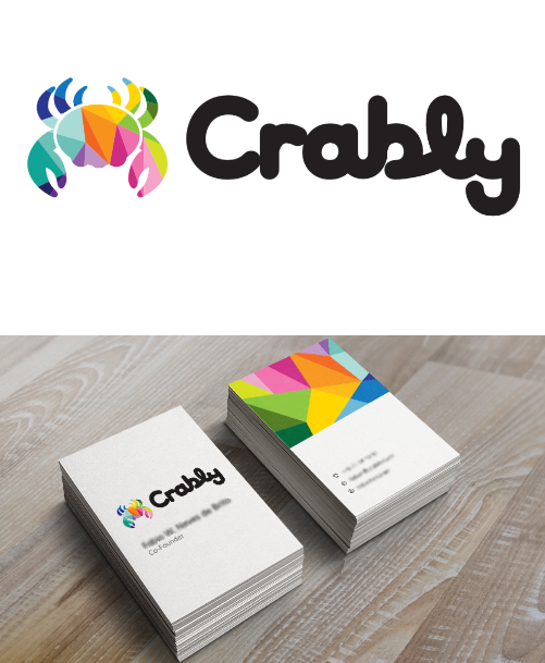
Stylised geometric crab captures the brand name while symbolising adaptability. Clean and modern, appeals to both technical and creative audiences.
Rounded, bold typeface conveys approachability and reflects the platform's user-friendly mission. Playful without sacrificing professionalism.
Coral, blue, green, and yellow. Multi-coloured geometric patterns within the crab represent creativity and diversity, ensuring competitive market standout.
Clean geometric design ensures clarity and recognisability from small icons to large promotional materials across all digital touchpoints.
04: OUTCOMES
The logo effectively encapsulates Crably's positioning as a creative, approachable CMS platform. Bold colours and modern geometry create a distinctive presence, directly addressing all objectives and constraints.
05: REFLECTION
Standing out in a saturated market required moving beyond safe minimalism. The tension between simplicity (functional, legible) and creativity (engaging, memorable) was the core design challenge throughout.
A logo must be functional at all sizes AND visually engaging. Getting both right meant many iterations; the crab motif only worked once the geometry was tight enough.
The crab reference gave instant brand meaning, adaptability and resourcefulness, without needing explanation. Constraints that carry meaning are the best kind.
Reconciling competing preferences required making the brand values explicit and measurable, giving everyone a shared framework to evaluate decisions against.
Every colour and shape choice was evaluated against future touchpoints: app icons, social profiles, swag, and dashboard UI. Future-proofing from day one.